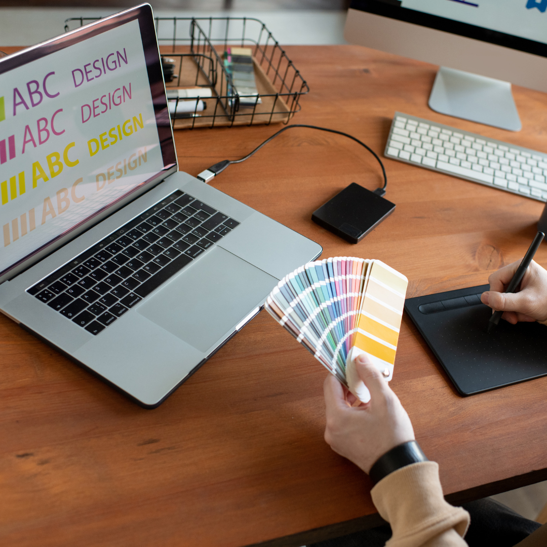
You’ve got a great product. You know your audience. But if your colors and fonts aren’t sending the right message, you’re losing attention—and sales—before the first click.
The truth is, branding isn’t just about aesthetics—it’s about psychology. Every shade and shape you choose triggers emotions and perceptions in your audience. Whether you’re aiming for trust, energy, luxury, or innovation, your visual identity either reinforces or undermines that message.
Let’s dig into how to make those choices work for your brand—not against it.
1. Color Sets the Emotional Tone
Color is the fastest way to evoke a feeling. It speaks before your words do—and it shapes how people feel about your brand instantly.
✔ Blue = trust, professionalism, calm (think banks and tech brands)
✔ Red = energy, urgency, excitement (great for calls to action or food brands)
✔ Green = growth, health, balance (ideal for wellness or eco-friendly brands)
✔ Black = sophistication, luxury, power
✔ Yellow/Orange = warmth, optimism, creativity
Choose color based on how you want people to feel when they experience your brand—not just what looks trendy.
2. Font Signals Personality and Positioning
Fonts aren’t just design choices—they’re brand voice in visual form. The right typeface can tell people whether you’re fun, elite, modern, or traditional—before they read a single sentence.
✔ Serif fonts (like Times New Roman) = classic, formal, traditional
✔ Sans-serif fonts (like Helvetica or Montserrat) = modern, clean, accessible
✔ Script fonts = elegant, feminine, creative (but use sparingly!)
✔ Bold display fonts = edgy, loud, attention-grabbing
Make sure your font reflects how you want to show up—and keep it consistent across all touchpoints.
3. Consistency Creates Visual Trust
If your fonts and colors shift from post to post or platform to platform, your brand starts to feel scattered and less trustworthy.
✔ Choose a primary and secondary brand color, and stick to them everywhere
✔ Set font pairings for headings, subheadings, and body copy—and use them consistently
✔ Avoid mixing too many styles—simplicity signals confidence
People trust what looks cohesive. Visual consistency is silent credibility.
4. Your Audience Will Feel It—Even If They Can’t Explain It
Most people won’t say “I love their kerning” or “that shade of navy really builds trust.” But their gut will know. That’s the power of subconscious influence.
✔ Test your colors and fonts on your actual audience—how do they feel about them?
✔ Notice reactions—are people engaging more with certain designs or formats?
✔ Don’t design based on personal taste alone—design for perception and performance
Visual decisions rooted in strategy outperform personal preferences every time.
5. Evolve When You Grow—But Keep Core Cues
As your business levels up, your brand look might need to grow with it. Just be careful not to lose recognition along the way.
✔ Update colors slightly (e.g., deeper tones, more contrast) to feel more premium or modern
✔ Refresh fonts to align with your current voice—but keep at least one visual anchor
✔ Document your choices in a brand style guide so every post, ad, or email reflects your brand identity
Refreshing your visual identity can attract new audiences—if you do it with intention.
Final Thoughts: Looks Matter—But Strategy Matters More
Your brand’s fonts and colors aren’t just decorations—they’re signals. When chosen intentionally, they attract the right audience, build trust faster, and make your messaging more impactful without saying a word.
At LGCY Marketing, we help small businesses build brands that not only look good—but convert.
Need help refining your visuals to align with your vision? Let’s craft a look that feels like you—and scales with you. 🚀